Brand design and visual identity system.

LOWTECH provides sustainable solutions for current issues. They specialize in repurposing discarted plastics by using effective and lowcost machinery to melt and transform the material.

After many hours of interviews, research and sketching, we reached a logo that was flluid, but still felt accountable and professional. During this process, there was a version with 3 base colors and an everchanging icon that was rejected, bt served as a stepping stone to get to the final result.

This is the main for for the LOWTECH logo. The icon points visually to a circulas dynamic, racalling the fluidity of plastic and ther three sides of recycling. The wordmar, on the other hand, brings a contrast to this fluidity, anchoring the logo with a geometric feel and sharp edges that evoke solidity, tecnology, and credibility.

The icon was built using three circles of different sizes (attained by usind the golden ratio) spaced 120º from each other in a circle. The result is a strong yet fluid, harmonic shape.

I selected 6 highlight tones, all around the same level of saturation and brightness, to represent the brand alongside two neutral tones, labeled "night" and "day". The multiple highlight colors come from the colorful nature of plastic and the consequent bright visuals of LOWTECH products.

The selected font to join he brand identity was Gotham, for its professional and solid look that contrasts with fluidity of the shapes and colors of the brand.

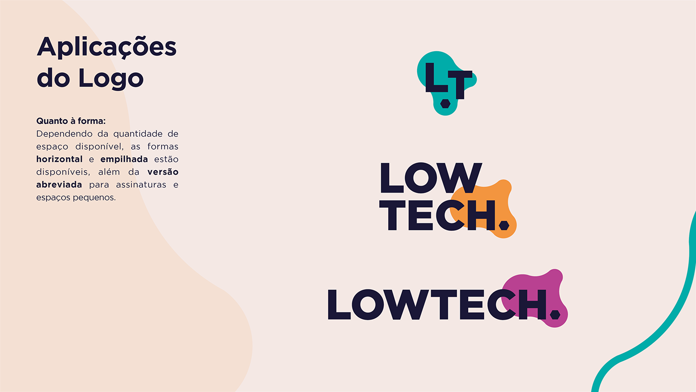
The logo can be used as a small symbol, stacked, or horizontal, depending on the space available for application.

There are also monochrome versions of the logo, if necessary.

The icon itself, applied in bigger sizes, is used as a recurring element in the visual identity of the brand, and help unite and tie any relevant material to the visual universe of the company.


